THE DOORS OF KNOWLEDGE
EXPERIENCE DESIGN INTERACTION DESIGN VISUAL DESIGN
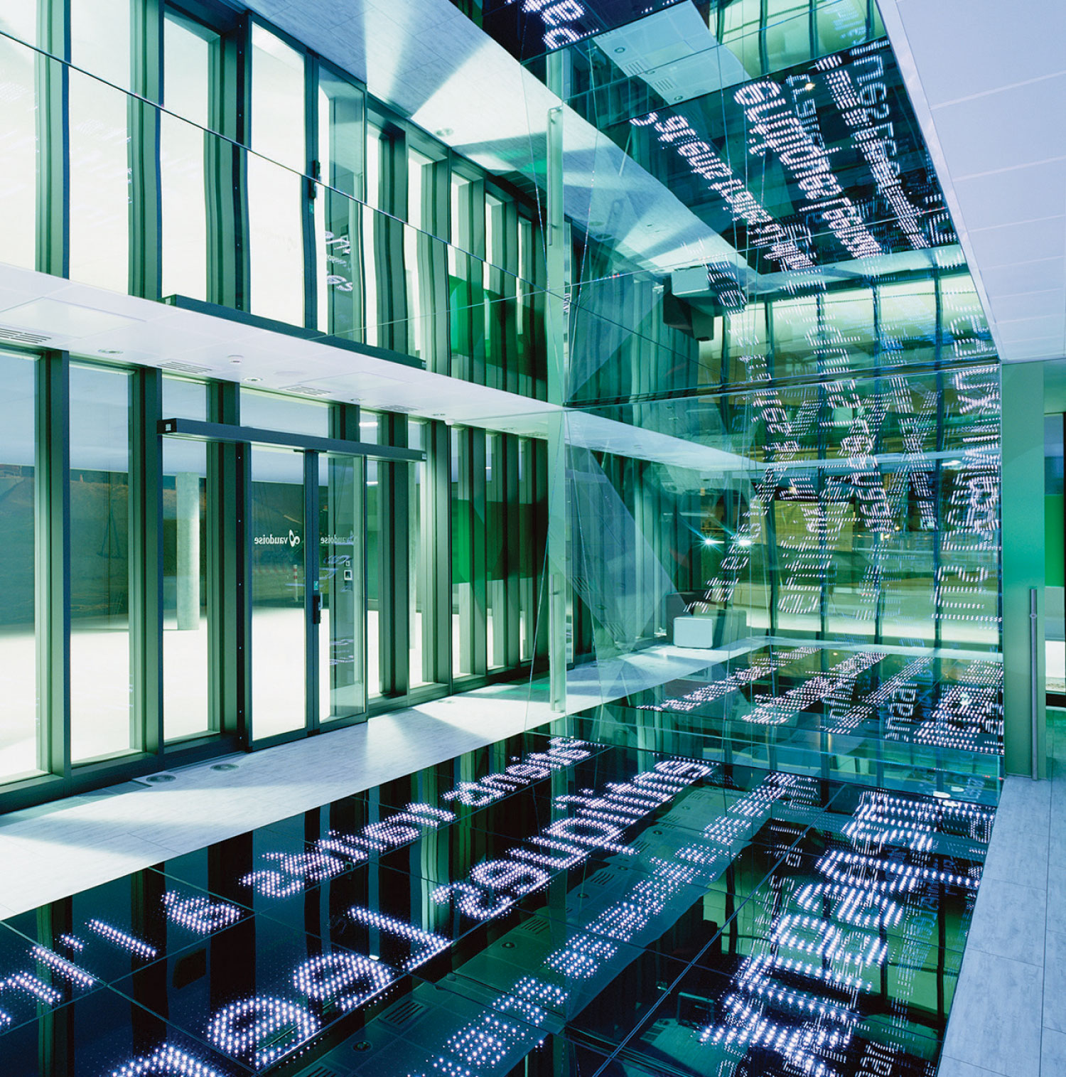
The initial question of this research project by design, touches on fundamental and critical notions involving our information age: Is it possible to create the sensation of bodily immersion with just text?Sitting at the outskirts of the town, at the first subway station, the aim of this installation is to improve the perception of an urban environment. Entering the town proposes an experience of the density of physical spaces, objects and encounters, and likewise of knowledge and information production. The project questions how one perceives such an experience in that it literally streams information into a public space.Light and contrast emitted by the 25 m2 screen-floor suspend the observer in a void.
The visual stimuli move at precise speeds to engage with one’s sense of gravity, allowing them to lose their sense of time and presence.The installation plays with the different levels of our perception: one flow of content is always optimized for reading, putting the emphasis on the meaning of information.The interactive features of the installation, through the sensitive floor, induces a relationship between the visitors, the content to read, and the immersive dimension. It activates readings in different depths in mirrored reflections.
I developed the production of content on the digital flooring starting from proposals created with students from the EPFL+ECAL Lab’s MAS in Digital Innovation. With the lab’s engineers, I then finalized 5 applications and delivered to the client, Vaudoise Insurance, with a remote controller for the application selection.
LED SCREEN HARDWARE
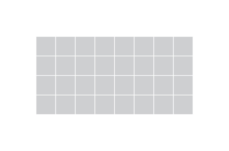
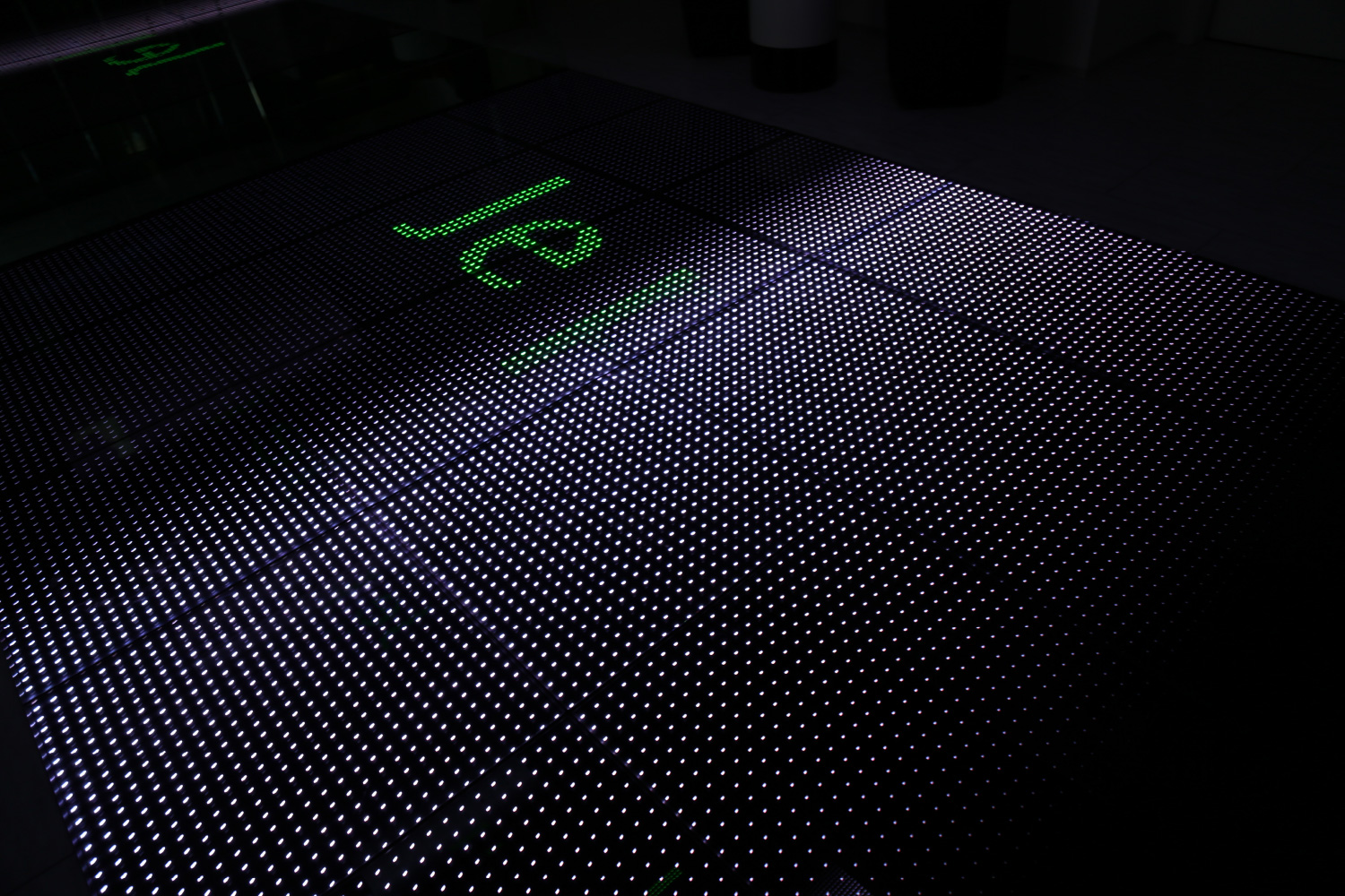
The screen is composed of 4 x 8 LED panels. Each panel contains 24 x 24 LED pixels. The screen resolution is then 192 x 96 pixels.The screen resolution is relatively low compared to the standard. This low resolution requires the definition of specific rules which determine what is possible and what is not possible to display. For example, images must have strong contrast and by at least as big as the text around them, or it will not be understandable.Typical graphic languages to use for the screen are silhouettes and icons as they have less details and a more noticeable outline.

INTERACTIVE APPLICATIONS
The Interactive language : As an elementary rule, interaction systems in public spaces must be simple and easily understood. The installation is located close to a major bus and metro station and so the target user is the commuter with little time. With the installation, the client (assurance company) should be transmit to the user. The screen is made of LED tiles with a capacitive matrix to detect the touch allowing direct feedback to be displayed on the floor in real-time.
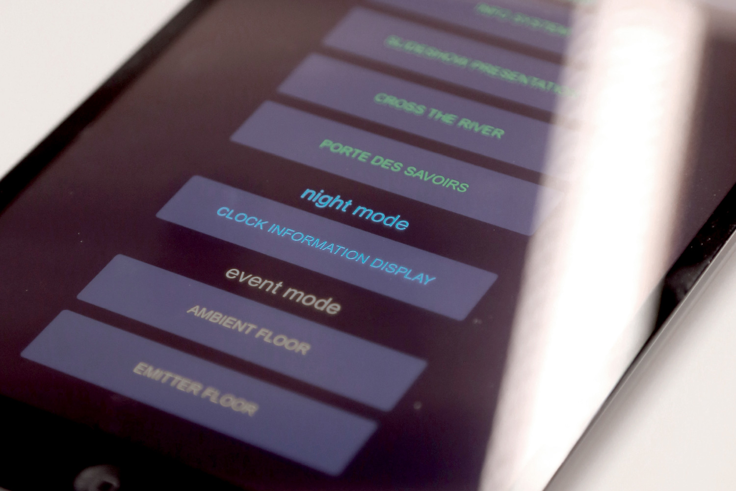
. DAY MODE For use during the day, when theclient’s office is open
. NIGHT MODE For use at night, when the client’soffice agency is closed
. EVENT MODE For a playful use of the spaceduring special events.
INFO SYSTEM FLOOR | Day mode
A map on the floor showing the main themes of the agency and where they are located. Interactivity : The interactive system is activated once the user walks on the floor. Depending on the direction chosen by the visitor, particles are emitted showing their final destination. AIM : Drive the user to explore the information points. Give information points more visibility.
SLIDESHOW PRESENTATION | Day mode
This application displays a sequence of icons that appear on the floor with a fade-in animation, each icon remains for 8 seconds before a new one appears. Vaudoise agents can create their own content using the delivered layout. Interactivity : No interactivity for this Display. AIM : Give Vaudoise an opportunity to use the interactive floor for marketing their products.
CROSS THE RIVER | Day mode
The screen is filled with white particles that simulate a river. A bridge is created as soon as the user is walking on the interactive floor. Interactivity : Green circles (simulating the bridge) appear under the feet of the user when walking on the floor. Green dots change the direction of the river particles.
AIM : Give a simple and fast interactive feeling to the user. Give a notion of safety being inside Vaudoise, with the green bridge being connected to the Vaudoise branding. Attract pedestrian attention with the moving particles.
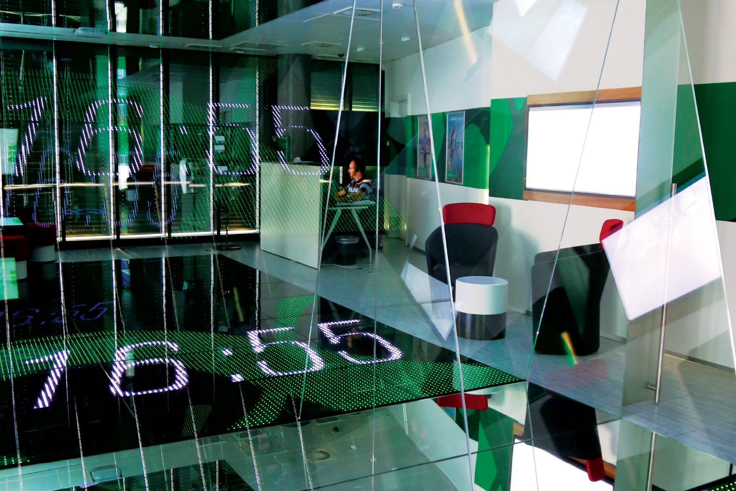
CLOCK INFORMATION DISPLAY | Night mode
The current time is visualized on a virtual plan. Interactivity : Only with the environment, there is no physical interactivity with the user.
AIM : Give the pedestrian useful information to create a positive experience through the Vaudoise screen. Attract people’s attention to Vaudoise.
EMITTER FLOOR | Event Mode
A texture is displayed and moved towards the mirror placed on the wall. Interactivity : When the user stays still for more than 4 seconds on one of the 32 square modules, the square becomes black. The user can then see and understand the reflection system as well as the theme of the texture.
AIM : Slow interaction. Help understanding of the reflection system. Immersion feelings.
The uniqueness of the installation has led us to create sessions with engineers, researchers and designers to study the visual and interactive language on the installation
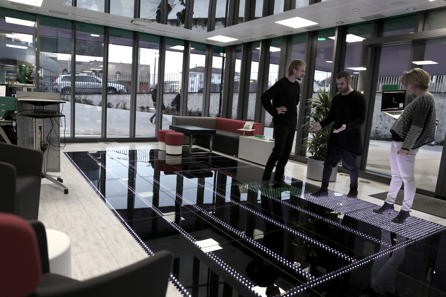

An application installed on tablets with OSC protocol allows the desired interactive project on the installation to be launched
