“nina” SONG SELECTION INTERFACE
USER EXPERIENCE USER INTERFACE
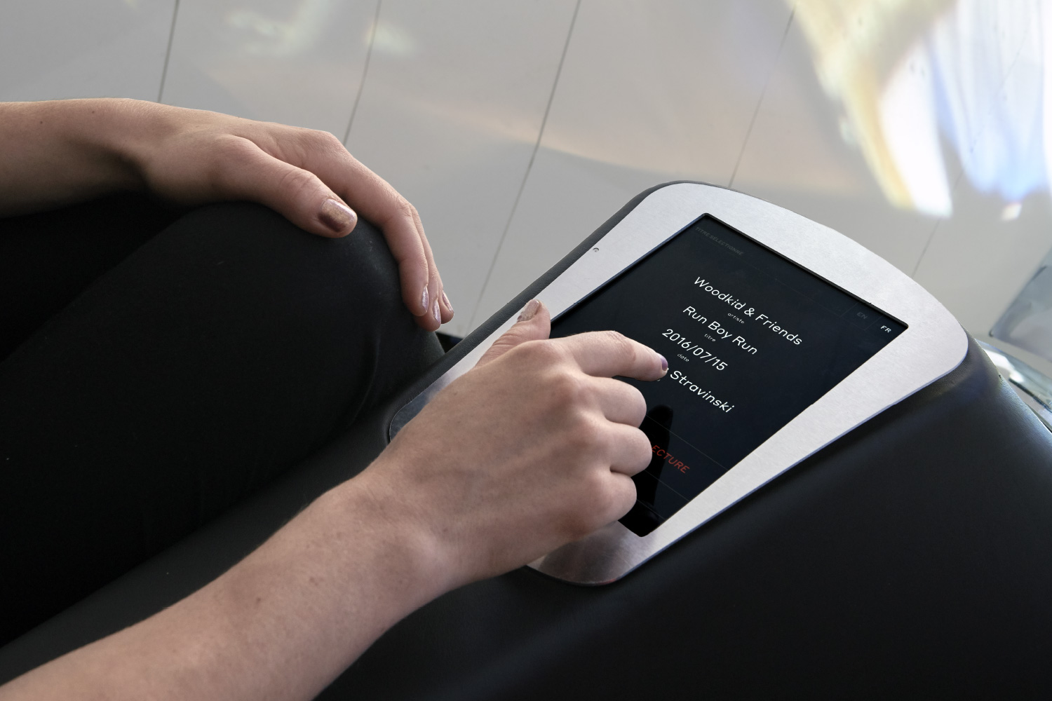
This project was about designing an interface for “Nina”, an interactive installation that showcases the video archives of the Montreux Jazz Festival. The aim of the interface is to allow visitors to select a song to listen to inside the installation. Having user tested where to locate the selection interface, we found that it was most effective to place it inside the installation, so that people could watch and study the playlist at the same time.
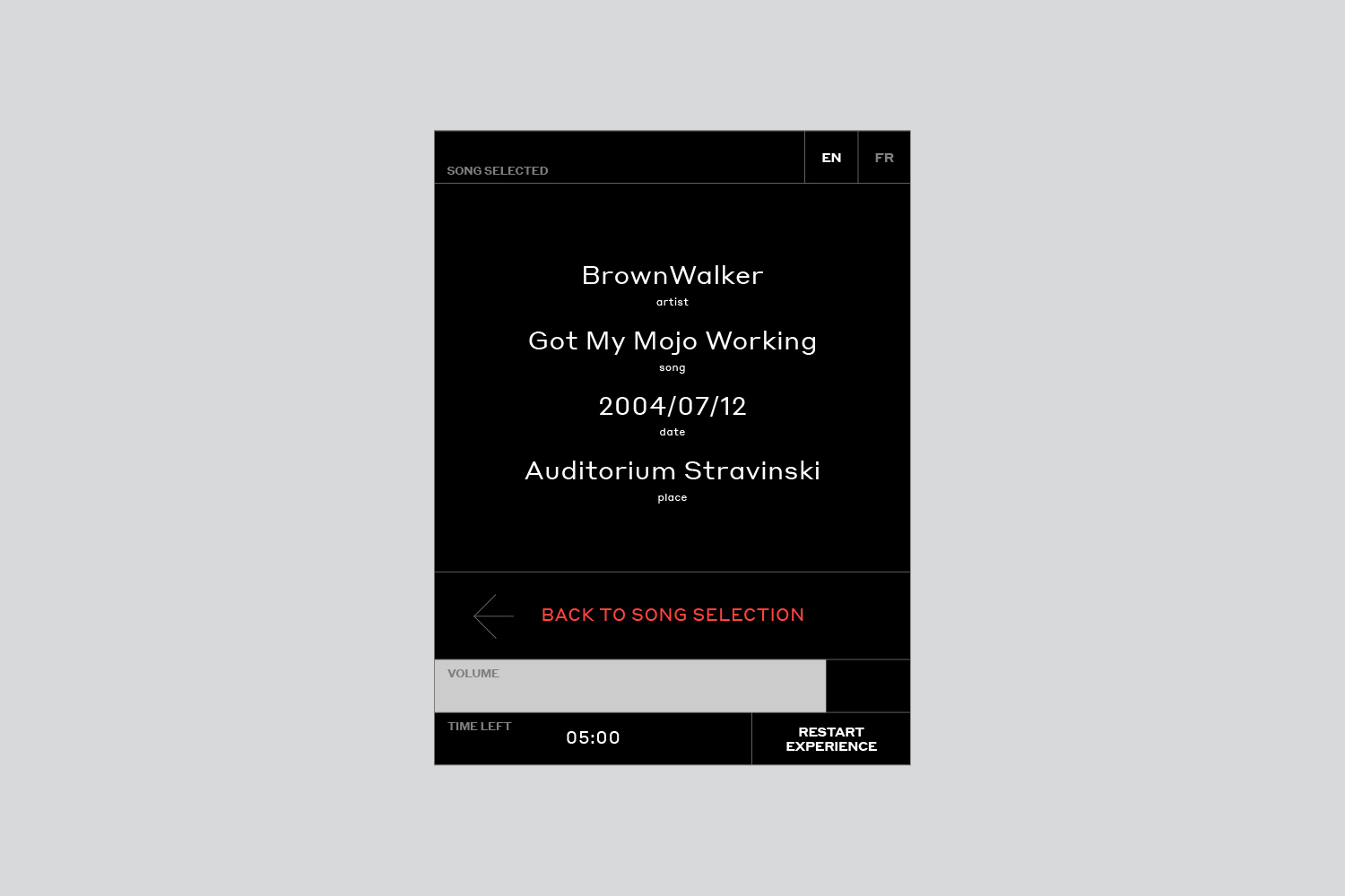
There were two important decisions that make this interface different from a standard music player. Firstly, instead of using alphabetical selection, which requires too much time for users in a public environment, I opted to present the content according to musical genre. Secondly, in order not to distract the user from watching the concert, once the song is selected, the interface is temporarily blocked and the user must unlock it in order to navigate again.We found that these two measures lead the user to be focused on the content not continuously connected to the interface.
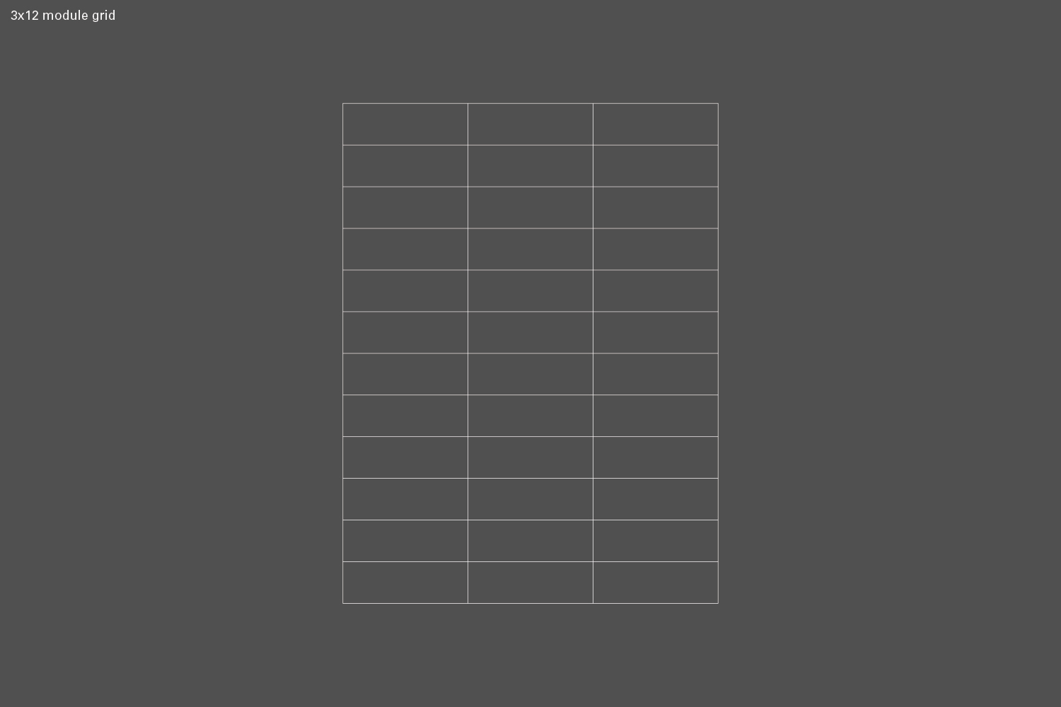
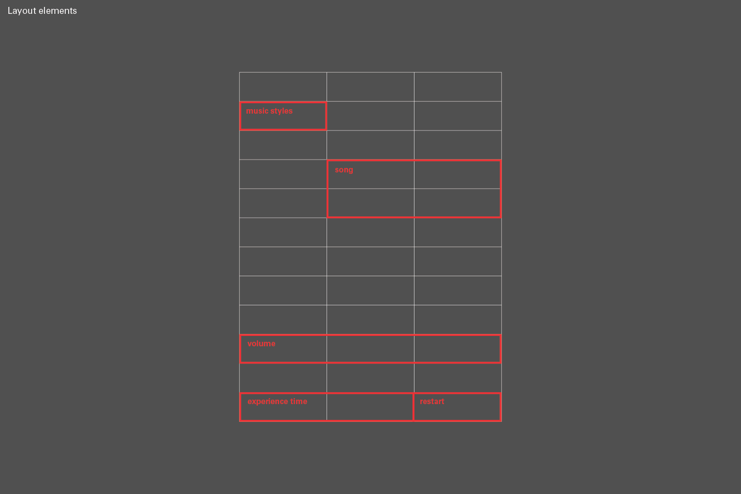
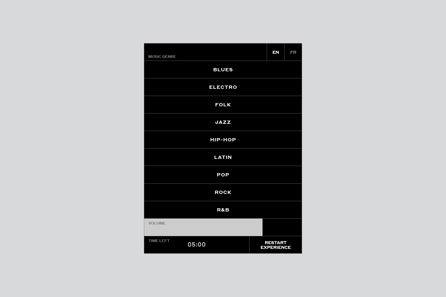
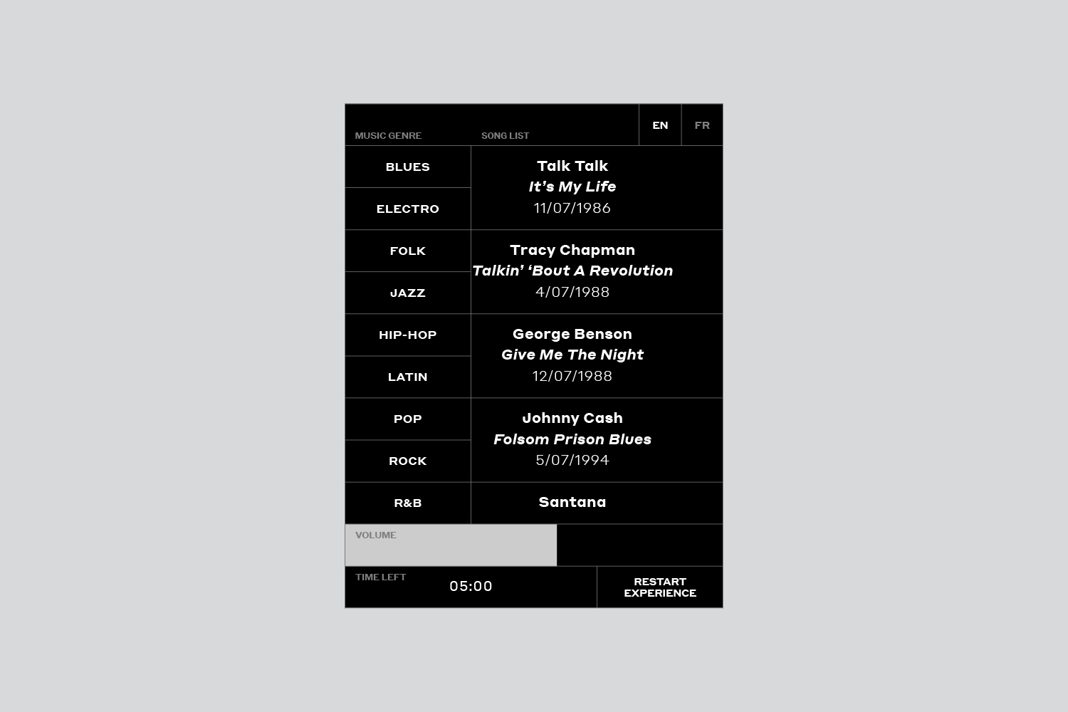
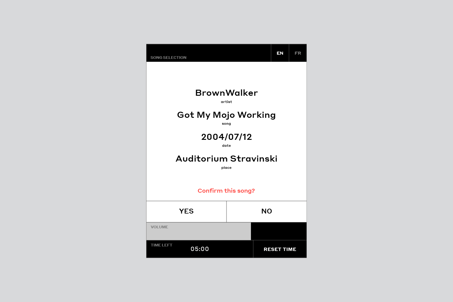
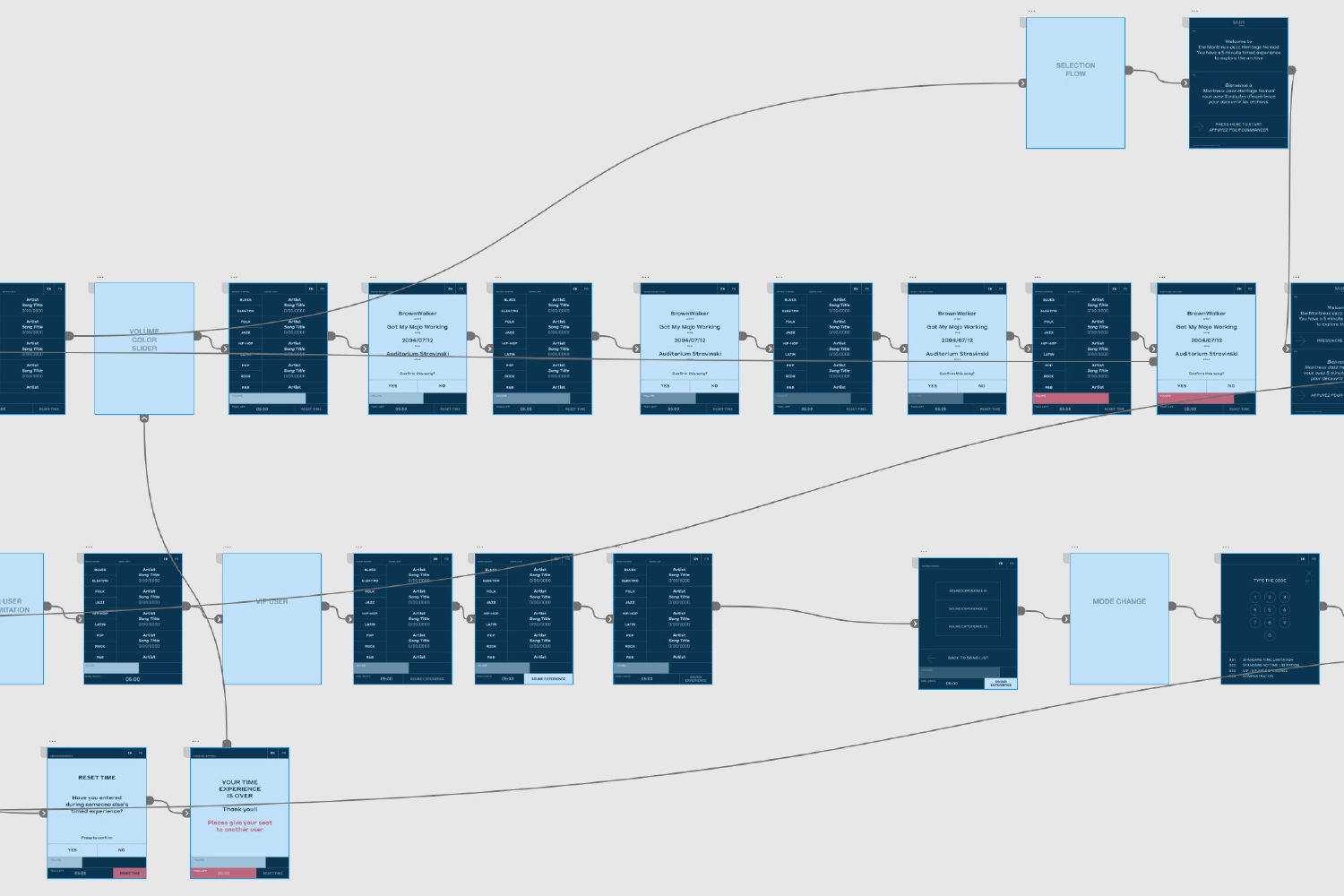
After confirming the selected song the interface freezes to allow the user to focus on the chosen song and to avoid them browsing the rest of the content

INTERFACE PRODUCTION PIPELINE AND TOOL
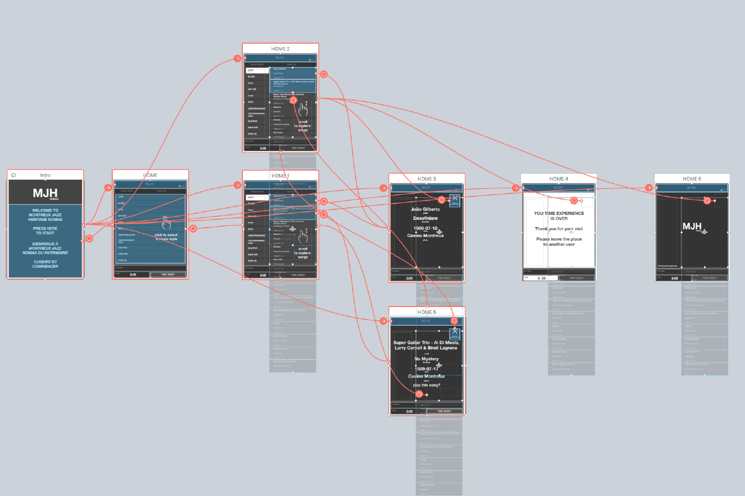
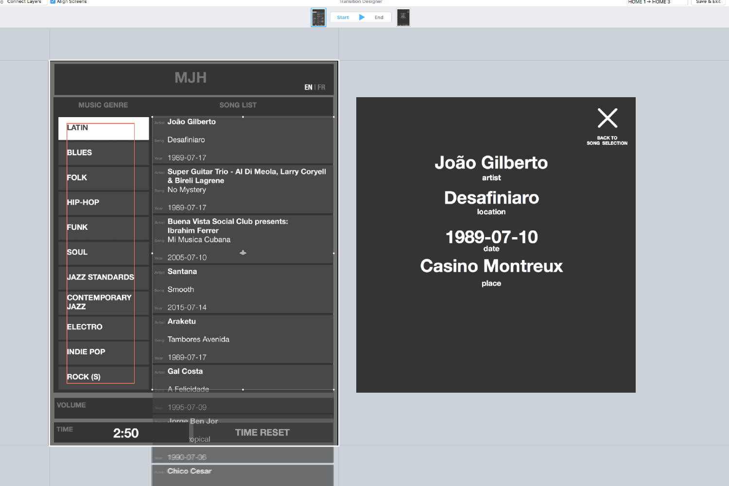
For the production of the interface the work was divided into different phases: Concept, Prototyping, Production. In the concept phase I defined and presented the project guidelines, the references and the main needs of the user, guided by the observations found during the experience tests on the project. Once the concept was accepted, I created the prototype of the project using Flinto to show the interactive and dynamic ideas. Subsequently, I started the interface design based on the visual codes previously implemented and I began to create the interactive connections.
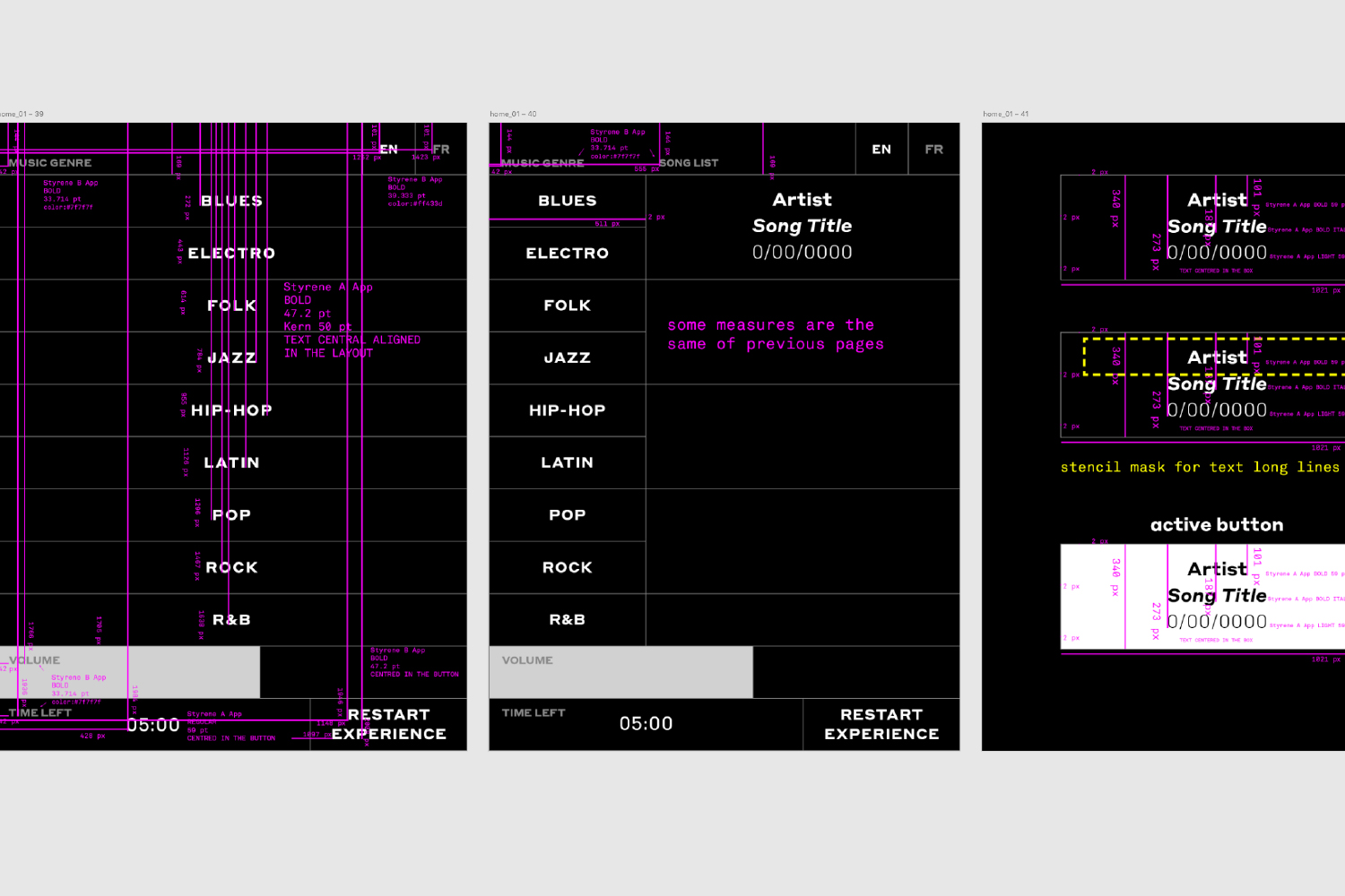
Finally, I exported all the assembly guidelines for the engineers who were building the application with Unity, and directly followed the assembly phases with them.A final analysis was made after the first official release through a questionnaire prepared by an expert UX psychologist who highlighted the strengths and small changes to be improved to increase clarity and immediacy of learning operation.

